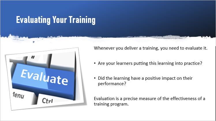
Do you think a pretty course with stunning visuals is good enough to enhance the learning experience and improve retention?
What if your learners get so lost in the visuals and miss out on the actual message being conveyed?
Any design or visual that detracts the learners from the content will contribute to the failure of your course. Be it a screen with an image that makes no sense or a screen with loads of content without any image. Neither of these can do any good.
As rightly said, “A picture is worth a thousand words.” If things can be better explained using images, go ahead and add them to eliminate the overwhelming text. But before you do this, ask yourself, “Does this image add any value to the learning?”.
The idea of designing an eLearning course is to help learners with useful information and not bombard them with unwanted and irrelevant text/visuals.
Visual elements that hamper the learning experiences
Materials presented using both text and visuals encourage learners to draw connections with the information already known to them. This makes their learning experience more meaningful and improves their retention. However, there are a few instances that may hamper such a learning process. This mainly happens when the visual elements on screen fail to connect with your learners. Let’s look at them.
Irrelevant graphics
Your graphics may be very rich, eye-catchy, and decorative. However, if they are not relevant to the content being discussed, then your learners are likely to get distracted.
There are times when the deadlines are too tight. In a hurry to deliver storyboards, we just can’t think of a graphic. The screen looks lonely and so we end up adding some random image just for the sake of adding it.
Remember, everything you add on the screen should have a purpose. The visual elements should contribute to the message and not confuse your learners. If your graphics are not meaningful, you’ll lose the opportunity to influence your learners.
The graphic shown here does not add any value to the learning.
This graphic is good enough to convey the actual message and adds more value to the learning.
Combining different graphic styles
Mixing different graphic styles (clipart/photos/illustrations) can make your screen look messy and distract your learners. Your graphics should be consistent. They should support each other and your content.

Mixing different graphic styles
Maintaining a consistent graphic style
Unclear or misleading navigation elements
Adding graphics for navigation buttons can enhance the look of your course. However, be mindful and maintain consistency throughout the course.
Give clear instructions on the course navigation. Experienced learners may be well versed with the navigation elements. However, novice learners may need more clarity on how to proceed further. In such cases, you may simply highlight the navigation buttons or use a hand tool to point out the buttons when the screen audio is complete.
Adding unwanted images to fill the white space
White space refers to a part of the screen that remains blank. This is often the most overlooked element in a screen layout. Most of us feel that that the whitespaces make the screen look simple and plain. As a result, we end up adding unwanted images.
Learn to embrace the white space. It has a soothing effect on the eyes and shifts the focus on your content development. This makes it easier for your learners to read and grasp information.
Completely used whitespaces are distracting for learners
Giving room for whitespaces draws attention to content
Using a conceptual image or an infographic for abstract content
Most of you might have worked on training courses related to compliance, securities laws, mutual funds etc. Honestly speaking, not many of us enjoy going through such courses. You just end up clicking the next buttons to get the final course completion screen.
Abstractions are your biggest enemies. Adding a conceptual image or using an infographic won’t do any justice to your learners. You need to spend time to paint a picture for people. Tell a story, find some examples, come up with some mnemonics, or use analogies. Supporting these strategies with visuals will have a better impact on your learners.
For instance, if your screen talks about securities law, cite examples of people who violated the norms and faced the consequences of it. Visual representation of such examples is more effective than just listing the laws and giving a conceptual image.
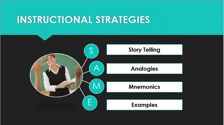
The overlooked element here is how learners will retain this information.
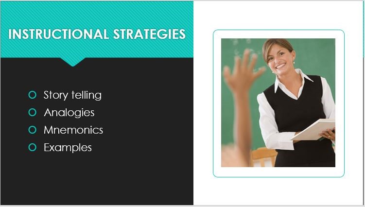
Usage of Mnemonics (word patterns) makes sure the learners remember these strategies.
Know where to draw the line
There’s always a return on investment when you supplement text with visuals. A course which is visually appealing has a very positive effect on the learners. However, you should know where to draw the line. It’s important to strike a balance between the “content” and the “visuals”. Even if one outweighs the other, the result may not be fruitful.
Visual communication is more effective than just a dummy visual. The images you add should be able to convey an idea and help learners relate between concepts.
So, the next time you design a course, make sure your visuals COMPLEMENT your content and not COMPETE with it.